Accenture
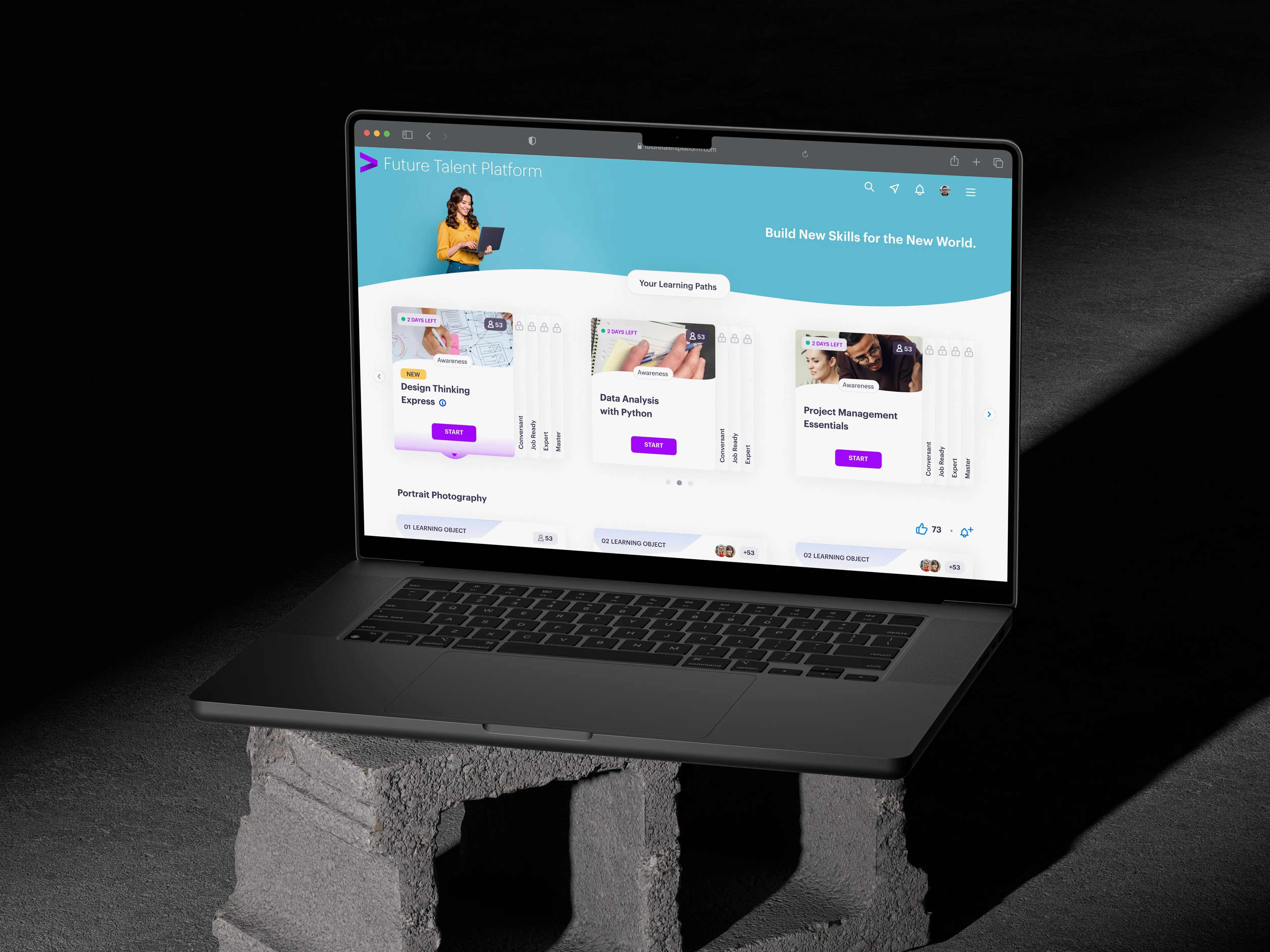
Future Talent Platform
Course Completion Rates Went Up Through 133% Through A Simplified UX
Problem
The Future Talent Platform (FTP), a corporate learning solution used by companies like Meta, Best Buy, and Vodafone, was facing a significant challenge—users were abandoning courses at an alarming rate.
The Red Flags
40% of users quit after completing just two levels.
85% failed to complete full skill tracks.
Stakeholders feared contract renewals were at risk, jeopardizing revenue.
User feedback indicated that the rigid learning structure was a major frustration, preventing users from advancing in a way that suited their prior knowledge and expertise.
Solution
To address this, I conducted user research, competitive analysis, and stakeholder discussions to devise an improved learning progression system. My goal was to introduce controlled flexibility, balancing user freedom with structured learning paths.
Key Actions Taken
User Surveys & Interviews: Identified core frustrations with rigid progression.
Competitor Analysis: Evaluated existing solutions and their drawbacks.
Stakeholder Discussions: Aligned curators, developers, and business leaders.
UI-Based System Overhaul: Designed a structured yet adaptable skill progression model.
A/B Testing: Compared UI-based vs. Excel upload methods to determine the most user-friendly solution.
After testing with real users, I implemented a UI-based skill management system, empowering curators to allow controlled skipping while maintaining learning integrity.
Impact
Just three months after launch, the results spoke for themselves:
Key Improvements
133% increase in course completion rates (15% → 35%).
50% reduction in dropouts, as users could now skip mastered content.
Clearer UI terminology, improving user comprehension.
The project reinforced the value of early stakeholder alignment, data-driven design, and user-centric problem-solving.
User Research
User Survey
I surveyed 300 FTP users (with a 52% response rate) and the results were eye-opening:
80% were unhappy with the system.
65% found the learning progression frustrating.
40% wanted the ability to skip levels.
The feedback was loud and clear—users felt trapped in a rigid structure. Instead of learning at their own pace, they were forced into a linear journey that didn’t accommodate their prior knowledge.
Competitor Analysis

I analyzed 5 major EdTech competitors—UpGrad, Unacademy, Coursera, LinkedIn Learning and Udemy. I found two extremes:
Too rigid (Coursera, UpGrad): Completion rates were low because users got stuck in strict pathways.
Too flexible (Udemy): Users skipped too much, leading to low engagement.
FTP needed a middle ground—one that gave users some control but ensured real learning.
User Interviews
I conducted in-depth interviews with beginner learners, experienced professionals, and content curators to get a 360° view of the problem.
Beginners wanted structure—They feared missing key lessons if skipping was allowed.
Experienced learners wanted flexibility—They hated repeating things they already knew.
Curators struggled to balance both needs—Managing content and skill progression was overwhelming.
The solution was clear—I needed controlled flexibility that gave freedom while maintaining learning integrity.
Design vs. Development: Overcoming Feasibility Challenges
Initially, I proposed a UI-based skill progression system, but the engineering team pushed back. Their concerns?
High development effort—Managing real-time permissions and content access would be complex.
Increased maintenance—Debugging and future upgrades would be costly.
UI Based Approach
The Counter-Proposal: Excel File Upload
Engineers suggested a file upload system, which required minimal development effort. However, it had major UX drawbacks:
No real-time feedback.
Errors required restarting the entire process.
Poor visibility over content changes.
A/B Testing
I tested both options with 8 content curators, and the results were clear:
7 out of 8 preferred the UI-based method for its ease of use and real-time feedback.
The Excel file method frustrated users due to frequent errors and lack of control.
Final Decision: I went ahead with a UI-based system, balancing usability with functionality.
Post-Launch Impact
Just three months after launch, the results spoke for themselves:
133% increase in course completion rates (15% → 35%).
50% reduction in dropouts, as users could now skip mastered content.
Clearer UI terminology, improving user comprehension.
One small tweak had a massive impact on engagement and retention.